5 tips for designing the perfect tour poster
- Eme

- Jun 26, 2025
- 2 min read

A tour poster isn't just a graphic piece: it's the first promise you make to your audience. It's a visual statement that says, "This is going to happen, and it's going to be epic." After designing (and seeing many fails), here are 5 key ideas I always apply to create an unforgettable and effective poster:
The poster must tell a story (in 3 seconds)
When someone sees it, they should feel an immediate emotion: adrenaline, nostalgia, energy, mystery. Think of your tour poster as a movie poster , not a tour planner. The design should capture the soul of the tour.
🎨 Ask yourself : What emotion do we want to evoke before they read a single word?

Give prominence to the artist's identity
The artist's logo or name should be effortlessly legible. The design can be experimental, but the artist's branding must dominate . People should remember the name, not the ornamentation.
📌 Golden rule : Test it, upload it to your stories, and if it's not clear who's tour it is, adjust it.
Legible dates, clear visual hierarchy
Nothing is more frustrating than a sign where you have to zoom in to understand when or where it is. Use a well-thought-out typographic hierarchy :
Artist name
Tour name (if applicable)
Main dates
Call to action (entries, website)
🔍 Tech tip : Test it in various formats, like an Instagram story or a street poster. If it doesn't read within 3 seconds, re-draft it.
Design for multiple formats from day one
A poster no longer exists solely on paper. Today it must adapt to:
IG feed + stories
TikTok (motion poster or teaser)
Web and ticketing platforms (the formats are endless)
Possible merch (stickers, t-shirts)
🧩 Tip : Design in layers, not as a single image. Think about how the information will be reflowed in each format.

Make it memorable, not generic
A poster is a statement on the wall. Look for a unique element : a texture, an illustration, a symbol, a palette that feels distinct. That "something" is what will make people stop and look at it and want to steal it and stick it in their home.
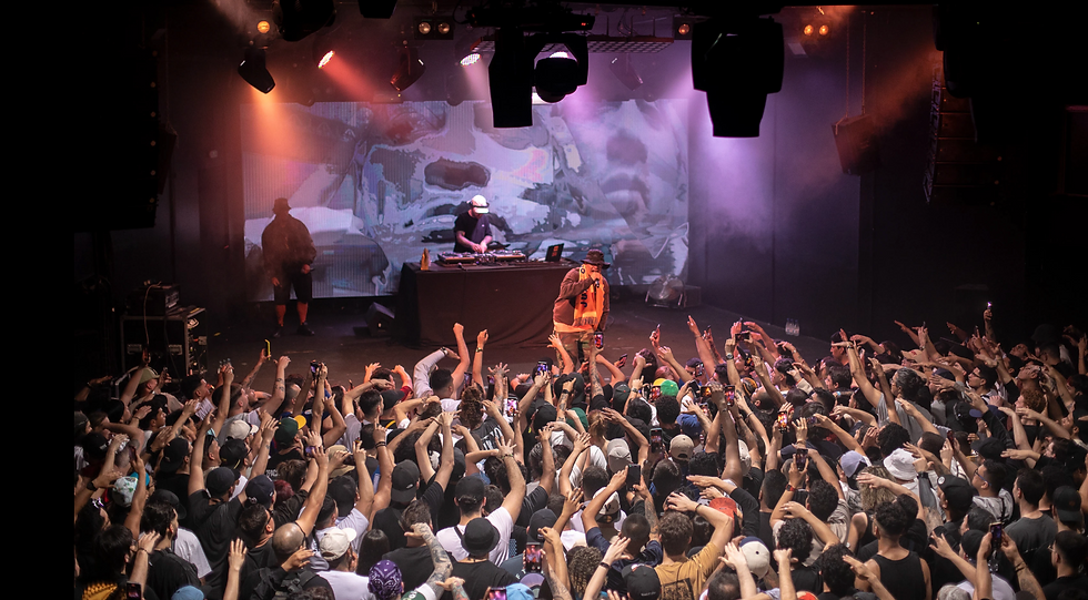
🎯 Real example : in the case of the poster I'm using as an example, the photograph already has enough information and has that element of attention that we need, everything else is relevant and complementary information.
Designing a tour poster is building an icon
Don't underestimate this piece. It's more than a design: it's the first glimpse of a moment many hope to experience firsthand. And if it's done right... the poster becomes a collecting item.
Share a poster that meets all of these recommendations in the comments, I want to see them ;)
Bye
Eme 💫


Comments